PAASE
Klaviyo design rebrand for
Union Hand-Roasted Coffee.
Using Klaviyo to
increase revenue.
Overview
Union approached PAASE looking for a revamp of their email design. The briefing was simple – the brand wanted a project that was evolutionary, not revolutionary.
The email design needed to have a seamless transition from website to email and vice versa, making sure email was on-brand and as impactful as possible. In other words, their email design had to be as fresh as their coffee beans.
row 1
row 2
Challenge
Initially, PAASE identified some opportunities within the current set-up; long copy and images (paired with a small number of CTA’s) was likely inhibiting sales, better utilisation of brand assets, layout, optimisation and new best-practice implementations.
PAASE was very clear with their recommendations and, after implementing them, we’re seeing a noticeable increase in our conversion.” Heidi Cullip, Head of Brand at Union.
Solution
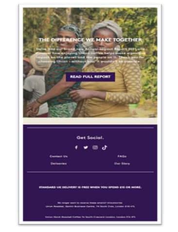
PAASE constructed a complete, comprehensive email design rebrand. The execution of the project focuses on a compelling design with a strategy that leverages the most effective touchpoints. PAASE were able to implement its best practice email template design.
The introduction of the navigation bar at the top of the email presents a clear call to action immediately with three variations enticing the customer to click through to the website.
Further, from the new Klaviyo builder, PAASE were able to construct text overlaying imagery for better optimisation which, in turn, limits the amount of scroll for the user allowing a CTA to be presented at all times.
The decision to increase the size of the CTA buttons was to catch the eye more and likewise correlate to the same size of the buttons on the website.
Clearer branding and use of colour have elevated the aesthetic of the email. Using the same colour palette from the website, the emails give a much more aligned look and a sense of brand continuation.
Result
The project’s success came down to the work done in tandem; PAASE worked with Union collectively for a common goal. With the aims and objectives achieved, the new revamp has become a huge triumph for Union!
“We’re really happy with the outcome of our project with PAASE. Our emails are now easier to read, are more aligned to our brand look and feel and have a clearer CTA. PAASE was very clear with their recommendations and, after implementing them, we’re seeing a noticeable increase in our conversion.”
Heidi Cullip, Head of Brand at Union

To read all our Case Studies, download our booklet by completing the form below:


