KLAVIYO: HUGE REBRANDING ANNOUNCEMENT
Klaviyo is playing the new landscape. After seven years, Klaviyo are rebranding to create a culture of philosophy and change. With exponential growth, funding, and product innovation, it’s no wonder Klaviyo are on a mission to take the platform to the next level.
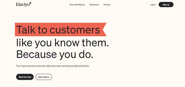
The rebranding includes a new visual design including the logo, iconography, type, imagery and colour palette. The new branding is a testament to the identity and values of Klaviyo. The pursuit to provide the best tools and playbooks for any creator, to have more control and ownership, is represented in this branding. The symbolism of a flag represents a sense of speed, fast pace, and a journey to greatness. The principles of this are outlined in data ownership, community building, guidance and success!
“Flags are the perfect symbol for Klaviyo — a company empowering and celebrating creators to own their data, to own their future, to see their purpose accelerated.” Andrew Bialecki, co-founder and CEO of Klaviyo.
The colours are rooted in neutrals with hints of bright colour. Klaviyo stated the imagery represents a warming style with a focus on the confidence and strength of Klaviyo’s customers. You can find all the different occasions they use their new branding on their website.

